Why designing an Olympic logo is so difficult (revisited)
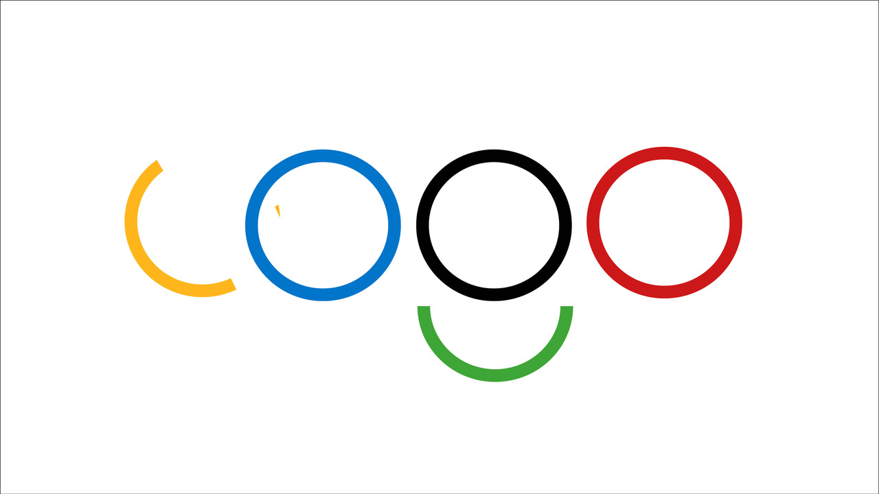
The first logo identifying the Olympic games was created by its founder, Baron Pierre de Coubertin, in 1913. The familiar five coloured interlocking rings symbolise the participating continents and ‘flags of all nations’ united in sports. Its simplicity and clarity have continued to deliver the values of the Olympics brand, and the main challenge to the designers appointed to create new symbols of each host city is in retaining the integrity of the original while adding their own unique imagery.
With every design, we all have an opinion, which we are of course entitled to. Personally, I think the simpler the design the more aligned it is with the comparative simplicity of the original rings. My favourite and one of Milton Glaser’s (well respected USA designer) is the 1964 Tokyo design with its simple shaded red rising sun. My least favourite is the Wolf Olins’ (UK design group) 2012 design comprising 4 sharp shapes representing the numbers in the year 2012. I find it jarring and that it somehow ignores the five rings, instead focussing on the date.** Personally, I think that matters, a date does not identify the character of a city. The rings are the very foundation of the Games and I like that it visually holds the hand of those logos that follow.
I was not alone with my opinion of the 2012 design. It was quoted as looking like a swastika and the word zion. Jonathan Glancey from Guardian arts blog said it was ‘fundamentally ‘patronizing’ and ‘fails the Olympic spirit completely’. Adrian Shaughnessy of Design Observer called it a ‘solid gold stinker ‘ and a ‘clunkey oafish design’.
I am, of course, curious about how logos are designed and about the messages they carry. Some of these are deliberately incorporated by the designers but we humans have been working with symbols for thousands of years and I think we unconsciously incorporate details and rituals as we design and deliver. I write about this sort of thing in my books. It amuses me to think that in the year of the contentious 2012 London logo, that perhaps the original logo was boosted. I wrote of this in my book Identify Yourself.
Some months before the London Olympics in 2012, a barge carrying a huge Olympics logo, costing £930,000, travelled down the Thames. Measuring eleven metres high, the glowing display sailed at dawn through the centre of London past iconic landmarks including the Tower of London, HMS Belfast and Tower Bridge. When we consider this event more closely it could be more than a publicity stunt. Water is a powerful liquid that, according to Japanese researcher Masaru Emoto, has been shown to hold memory. Emoto spent nearly 20 years studying the effect of consciousness on water and found that words, sounds, thoughts and emotions had an effect on the molecular structure of water. For example, water from a container labelled with Evil on it formed globular shapes when frozen whereas water from a container with the words Thank you formed beautiful snowflake shapes.
The French immunologist Jacques Beneviste provided evidence that water that once contained biological molecules retained the effect of these molecules after extensive dilution meant they no longer physically existed in it. This, of course, is the premise behind homeopathy.
Could the journey of the original Olympics logo have carried the energy of the Olympics history along one of the world’s most famous waterways to prepare the space 150 days before the event? What prompted the choice of the original symbol of five rings, which interlock to form the sacred symbol known as a vesica piscis and symbolising the feminine, rather than the controversial 2012 logo? Interestingly the Games became the first at which every sport had female competitors.
Why 150 days before the event? I asked numerologist Bonni Southey for her take on the number 150 and she said: ‘The numbers within 150 days represent a subtle communication of a powerful, intentional path of leadership and success – the 1 and the 5 engender pioneering, winning, strong yet flowing activity. All of this impulse is further empowered and completed by the zero, making the slow passage of the barge a very deliberate and intentional international communication of a winning intention. All the numbers add up to a 6 which talks about legend and legacy.’ I don’t know what the date was or I would have asked an astrologer.
Why was dawn chosen for the timing, the start of a new beginning? Was there any significance of the short journey through the heart of the City of London, one of the world’s most important financial centres? The 2012 logo is the only one I can find that makes the year the primary focus. In 1968, Mexican designers integrated the date figures but they also included the original Olympics logo as an integral part of the design. 2012 adds to 5, knows as a magical number, and was regarded as the end-date of a 5,126-year-long cycle in the Mesoamerican Long Count calendar. Perhaps it did symbolise the dawn of some sort of new beginnings. Great Britain did do very well even taking into account the home advantage.
Priming a logo can influence consumer’s behaviour
 Simply gazing at a logo can affect our subsequent behaviour. There is substantial evidence that brands have automatic associations with specific goals. Consumer behaviour can be influenced …
Starbucks ******mas cup
I am intrigued by the fuss about Starbucks’ Christmas cups. I find that the fascination with the design goes towards proving how powerful a tool it is! Starbucks has been accused of using GMO milk, unfair labour …
Brands know they have a spirit
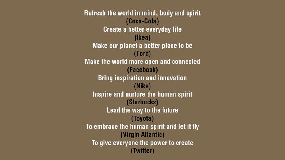
Refresh the world in spirit (Coke) Inspire and nurture the man spirit (Starbucks) Embrace the human spirit and let it fly (Virgin) The world of spirit seems to be recognised by brands. Many straplines of …
Taking control of logos in fashion
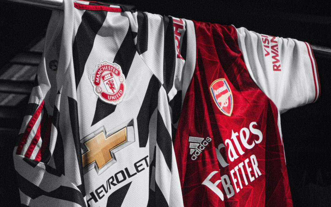
Is the logo ‘stripped of its corporate purpose’ if it used as a piece of art? Juxtaposed with random logos on a garment? This does not look too different to the football shirts which appear to change logos with …
Protecting the mermaid
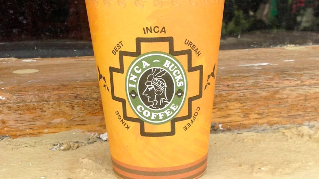
This is a cup from a coffee shop I found in Peru. I don’t think Starbucks have found this one but they are suing a Bangkok based coffee stall over the misuse of the Starbucks logo. Maybe because it …
The first artists were women
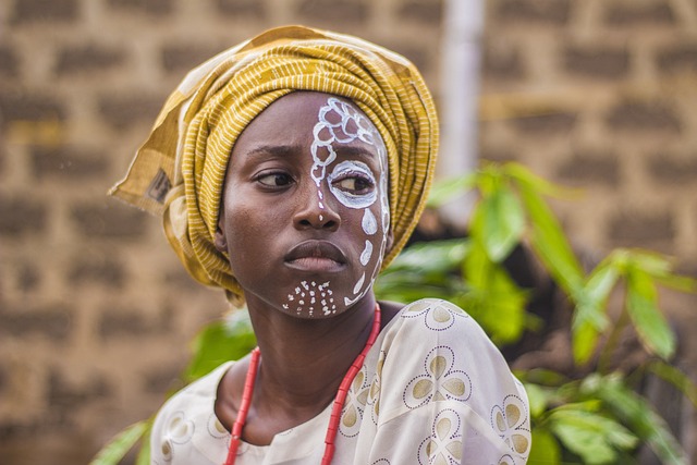
Logos are a combination of a word and picture (symbol). The former is linear, we read from left to right, logically from the masculine attributed part of the brain. The latter is more intuitively recognised and …
Fighting over a couple of kisses
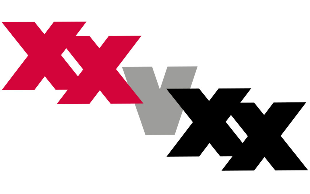
Protective brands know the value of their logos and go to immense lengths to protect them. An X is a kiss, it marks the spot and a cross stands for relationships. Two Xs is double the value and Exxon is going …
No logos in Sao Paolo
In 2006 the mayor of Sao Paolo banned all outdoor advertising, after the initial flurry of objections, now over 70% of residents approve. I imagine the first sign above is now no longer there but …
Does London need a logo?
A logo for London? The YouGov poll, which was commissioned by Landor, says 51 per cent of those surveyed think London should have its own logo “like other global cities New York, Berlin …

The colour purple
Getting a colour just right is imperative for brands that want to succeed. Purple has traditionally been reserved for royalty but Cadbury’s want to reserve it for themselves. They tried to fight off Darrell Lea …
Why designing an Olympic logo is so difficult (revisited)
What is most important, people or the planet? The Earth can survive very well without us, probably better than it is right now, but we cannot survive without the Earth.
Only so many of us can fit on Elon’s spaceship, and then, do we really want to transport the mindsets that got Earth into its current polluted state onto a pristine planet?
Since the 1950s, some believe the start of the industrial age, we have entered the Anthropocene age. This is based on the assumption that, for the first time, we have ushered in a new epoch by altering the earth.
The Smithsonian says: “humankind has caused mass extinctions of plant and animal species, polluted the oceans and altered the atmosphere, among other lasting impacts.”
Who is to blame? How have we been tempted to ignore Mother Earth when she has sustained and nourished our human lives for hundreds of thousands of years? And the result we are harvesting from this ignorance is the creation of an environment that not only ceases to support our health and well-being but becomes toxic and unsustainable to our own lives.
Brands are expert in creating our future dreams for us. John Perkins, shaman and ex economic hit man, tells us we need to change our dream. He labels our current economy as a death economy. And our economy is in direct opposition to our planetary health. Economists bemoan the fall in population (consumers are required for growth); environmentalists state there are too many people in the world.
Without a deep connection to nature, we will fail in both.
Paula Gunn Allen, a Native American poet, activist, scholar and novelist, explains:
“We are the land… that is the fundamental idea embedded in Native American life… the Earth is the mind of the people as we are the mind of the earth. The land is not really the place (separate from ourselves) where we act out the drama of our isolate destinies… It is rather a part of our being, dynamic, significant, real. It is our self… It is not a matter of being ‘close to nature’… The Earth is, in a very real sense, the same as our self (or selves)…”
Our current economy depends on increasing consumption, and brands are exemplary in helping us part with our money for goods we really don’t need but must have. Brands promote luxury goods to the rich and tempt the poor with products they can ill-afford and may harm, such as tobacco. Much of the time, sourcing and creating the raw materials threatens the balance of nature, which is further jeopardised during the manufacturing processes and this can also damage the well-being of the workers involved.
It really is an incredible power that brands hold over us. While knowing all this, we continue to buy into the marketing promise. But we can learn from brands’ successes and use them to help create our own. Brands are excellent in creating tribes for us to belong to. It’s a primal urge to belong. Are we an Audi driver? A Levis’ wearer? A Mac user? What do we aspire to? How can we connect back to our own, true, deep, inner longings and aspire to our incarnated uniqueness, which we can express to the world using our own, proven successful, branding techniques?
We can and must create a new tribe of tribes, tribes with values that connect us to others ready to change their future, to promote a better, sustainable world. Using our own specially designed future magnets (logos), we can attract like-minded people who care about the planet, about nature, including the plants and animals, and about ensuring the best for future generations rather than profit now. Brands helped us get into this mess; the techniques they have honed can help us get out of it and heal. Nothing unites us more than a logo that invites us to share a single intention.
Indigenous people know this and when they become disconnected from their tribe they experience a terrible loneliness that ‘could only be healed through interrelationships and participation in meaningful ceremonies with the whole tribe’. (O’Nell 2004).
Building relationships, ceremony, ritual and participation are all brand tools, it is our ability and responsibility to create our own, those that are meaningful and nurture us and our world.
‘Deep planetary changes and environmental destruction are necessitating healing at individual, community and global scales. Feelings of pain, suffering, fear, anger and grief for those directly affected by climate change or those watching through TV screens are real.’
‘If humanity learned from and embraced this cosmology, we would understand that our wellbeing and healing is dependent on the wellbeing and healing of the Earth and nature, and that we have reciprocal duties and responsibilities to maintain balanced relations with it. Being one with nature, rather than separate to it, helps us to break down the way we currently control and conquer nature, to our own detriment – an approach some have termed “eco-apartheid”. Wellness and healing require caring for and balancing the different parts of our “self” – the spirit, body, mind and the Earth.’
What can we design and foster for the common good? What can we invest in our own logo, one that expresses our deep longing?
Priming a logo can influence consumer’s behaviour
Simply gazing at a logo can affect our subsequent behaviour. There is substantial evidence that brands have automatic associations with specific goals. Consumer behaviour can be influenced …
Starbucks ******mas cup
I am intrigued by the fuss about Starbucks’ Christmas cups. I find that the fascination with the design goes towards proving how powerful a tool it is! Starbucks has been accused of using GMO milk, unfair labour …
Brands know they have a spirit
Refresh the world in spirit (Coke) Inspire and nurture the man spirit (Starbucks) Embrace the human spirit and let it fly (Virgin) The world of spirit seems to be recognised by brands. Many straplines of …
Taking control of logos in fashion
Is the logo ‘stripped of its corporate purpose’ if it used as a piece of art? Juxtaposed with random logos on a garment? This does not look too different to the football shirts which appear to change logos with …
Protecting the mermaid
This is a cup from a coffee shop I found in Peru. I don’t think Starbucks have found this one but they are suing a Bangkok based coffee stall over the misuse of the Starbucks logo. Maybe because it …
The first artists were women
Logos are a combination of a word and picture (symbol). The former is linear, we read from left to right, logically from the masculine attributed part of the brain. The latter is more intuitively recognised and …
Fighting over a couple of kisses
Protective brands know the value of their logos and go to immense lengths to protect them. An X is a kiss, it marks the spot and a cross stands for relationships. Two Xs is double the value and Exxon is going …
No logos in Sao Paolo
In 2006 the mayor of Sao Paolo banned all outdoor advertising, after the initial flurry of objections, now over 70% of residents approve. I imagine the first sign above is now no longer there but …
Does London need a logo?
A logo for London? The YouGov poll, which was commissioned by Landor, says 51 per cent of those surveyed think London should have its own logo “like other global cities New York, Berlin …
The colour purple
Getting a colour just right is imperative for brands that want to succeed. Purple has traditionally been reserved for royalty but Cadbury’s want to reserve it for themselves. They tried to fight off Darrell Lea …