
The importance of in and out

There is a club in London called the In and Out club, named for the gates directing members in the right direction.
Michael Beckwith, the Founder and Spiritual Director of Agape International Spiritual Center in Los Angeles, and an award-winning author, says he sees his clients coming in, entering like a golden Buddha, bringing their problems. This entrance aligns him with his intention before he starts to work with them.
We spend a lot of time on projects but how we receive them and how we send them off to do their work play a vital part in their success.
When I worked in design at Pentagram, we were taught how to wrap packages leaving the building so that Pentagram’s reputation for detailing and caring was enforced beyond the front door and visible to anyone involved, including the receptionist or secretary who may receive and/or open the package. The corners were neatly trimmed, the tape cut with scissors or scalpel and the address clearly, beautifully written.
In my work designing logos, I know that how we receive and deliver our logos is vital to the integrity of the final design. When I am designing, the concept(ion) is vital. How it enters the world, the quality of the intention, the talents, mood and state of the client, and me the designer. When it is time to exit and deliver its intentions, every design detail has been considered including the timing, perhaps even the alignment of stars and the season, to ensure the best potential success. Conversely, a perfunctory delivery, with poor attention to detail, from the choice of social media used to communicate, the cleanliness of delivery vehicles and the first word said when a client rings, can ruin the concept of a perfectly good logo.
We often think that the actual designing of a logo is the most important part and, once it is complete, the work is done. But this vital action could not take place without the initial brief and it could not do its work without the exit, the delivery.
The latter is what carries the energy the logo, embedding the intention of the desired future, intact into the outside world where it can do its work.
Everything matters, every detail.
The invitation to engage with the logo is delivered embedded in the design, like a doorway encouraging us to open. The first picture above was taken in fashionable Fitzroy in Melbourne. I wanted to touch and open this door; the handle is full of the promise of something wonderful within. The second entrance is the Chelsea Arts Club in London. Normally relatively inconspicuous, the entrance was allowed to seasonally express itself, much like the artist members within. I was strangely reassured when I saw this perfectly stacked recycling from a café in the third picture. I know this café. Their food and service is impeccable as is their detailing, from their smile when you enter to the herbs and spices they use. So, I felt comforted that this attention carried through to their rubbish! They really were committed to their intention of excellence which would be carried to the trash collectors who would notice and appreciate it, thus continuing to build the warmth. Finally, the last photo is from Bali – an exit sign in case of a Tsunami. I liked this as it shows how it is important to ensure our exits are targeted for purpose and in the right place to do their work to the full.
All these observations can be used in the design of a logo.
Priming a logo can influence consumer’s behaviour
 Simply gazing at a logo can affect our subsequent behaviour. There is substantial evidence that brands have automatic associations with specific goals. Consumer behaviour can be influenced …

Starbucks ******mas cup
I am intrigued by the fuss about Starbucks’ Christmas cups. I find that the fascination with the design goes towards proving how powerful a tool it is! Starbucks has been accused of using GMO milk, unfair labour …
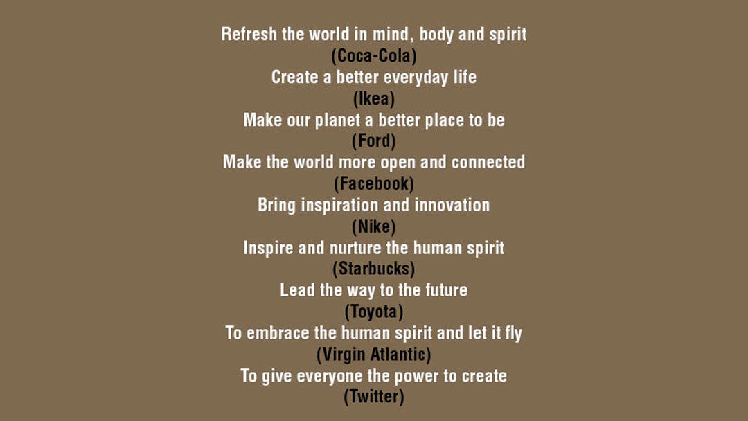
Brands know they have a spirit
Refresh the world in spirit (Coke) Inspire and nurture the man spirit (Starbucks) Embrace the human spirit and let it fly (Virgin) The world of spirit seems to be recognised by brands. Many straplines of …
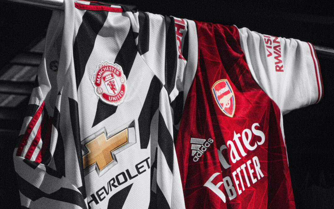
Taking control of logos in fashion
Is the logo ‘stripped of its corporate purpose’ if it used as a piece of art? Juxtaposed with random logos on a garment? This does not look too different to the football shirts which appear to change logos with …
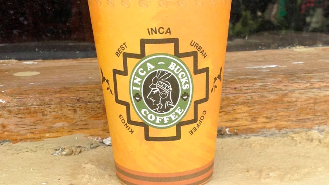
Protecting the mermaid
This is a cup from a coffee shop I found in Peru. I don’t think Starbucks have found this one but they are suing a Bangkok based coffee stall over the misuse of the Starbucks logo. Maybe because it …

The first artists were women
Logos are a combination of a word and picture (symbol). The former is linear, we read from left to right, logically from the masculine attributed part of the brain. The latter is more intuitively recognised and …

Fighting over a couple of kisses
Protective brands know the value of their logos and go to immense lengths to protect them. An X is a kiss, it marks the spot and a cross stands for relationships. Two Xs is double the value and Exxon is going …
No logos in Sao Paolo
In 2006 the mayor of Sao Paolo banned all outdoor advertising, after the initial flurry of objections, now over 70% of residents approve. I imagine the first sign above is now no longer there but …
Does London need a logo?
A logo for London? The YouGov poll, which was commissioned by Landor, says 51 per cent of those surveyed think London should have its own logo “like other global cities New York, Berlin …

The colour purple
Getting a colour just right is imperative for brands that want to succeed. Purple has traditionally been reserved for royalty but Cadbury’s want to reserve it for themselves. They tried to fight off Darrell Lea …
The importance of in and out
There is a club in London called the In and Out club, named for the gates directing members in the right direction.
Michael Beckwith, the Founder and Spiritual Director of Agape International Spiritual Center in Los Angeles, and an award-winning author, says he sees his clients coming in, entering like a golden Buddha, bringing their problems. This entrance aligns him with his intention before he starts to work with them.
We spend a lot of time on projects but how we receive them and how we send them off to do their work play be a vital part in their success.
When I worked in design at Pentagram, we were taught how to wrap packages leaving the building so that Pentagram’s reputation for detailing and caring was enforced beyond the front door and visible to anyone involved, including the receptionist or secretary who may receive and/or open the package. The corners were neatly trimmed, the tape cut with scissors or scalpel and the address clearly, beautifully written.
In my work designing logos, I know that how we receive and deliver our logos is vital to the integrity of the final design. When I am designing, the concept(ion) is vital. How it enters the world, the quality of the intention, the talents, mood and state of the client, and me the designer. When it is time to exit and deliver its intentions, every design detail has been considered including the timing, perhaps even the alignment of stars and the season, to ensure the best potential success. Conversely, a perfunctory delivery, with poor attention to detail, from the choice of social media used to communicate, the cleanliness of delivery vehicles and the first word said when a client rings, can ruin the concept of a perfectly good logo.
We often think that the actual designing of a logo is the most important part and, once it is complete, the work is done. But this vital action could not take place without the initial brief and it could not do its work without the exit, the delivery.
The latter is what carries the energy the logo, embedding the intention of the desired future, intact into the outside world where it can do its work.
Everything matters, every detail.
The invitation to engage with the logo is delivered embedded in the design, like a doorway encouraging us to open. The first picture above was taken in fashionable Fitzroy in Melbourne. I wanted to touch and open this door; the handle is full of the promise of something wonderful within. The second entrance is the Chelsea Arts Club in London. Normally relatively inconspicuous, the entrance was allowed to seasonally express itself, much like the artist members within. I was strangely reassured when I saw this perfectly stacked recycling from a café in the third picture. I know this café. Their food and service is impeccable as is their detailing, from their smile when you enter to the herbs and spices they use. So, I felt comforted that this attention carried through to their rubbish! They really were committed to their intention of excellence which would be carried to the trash collectors who would notice and appreciate it, thus continuing to build the warmth. Finally, the last photo is from Bali – an exit sign in case of a Tsunami. I liked this as it shows how it is important to ensure our exits are targeted for purpose and in the right place to do their work to the full.
All these observations can be used in the design of a logo.
Priming a logo can influence consumer’s behaviour
Simply gazing at a logo can affect our subsequent behaviour. There is substantial evidence that brands have automatic associations with specific goals. Consumer behaviour can be influenced …
Starbucks ******mas cup
I am intrigued by the fuss about Starbucks’ Christmas cups. I find that the fascination with the design goes towards proving how powerful a tool it is! Starbucks has been accused of using GMO milk, unfair labour …
Brands know they have a spirit
Refresh the world in spirit (Coke) Inspire and nurture the man spirit (Starbucks) Embrace the human spirit and let it fly (Virgin) The world of spirit seems to be recognised by brands. Many straplines of …
Taking control of logos in fashion
Is the logo ‘stripped of its corporate purpose’ if it used as a piece of art? Juxtaposed with random logos on a garment? This does not look too different to the football shirts which appear to change logos with …
Protecting the mermaid
This is a cup from a coffee shop I found in Peru. I don’t think Starbucks have found this one but they are suing a Bangkok based coffee stall over the misuse of the Starbucks logo. Maybe because it …
The first artists were women
Logos are a combination of a word and picture (symbol). The former is linear, we read from left to right, logically from the masculine attributed part of the brain. The latter is more intuitively recognised and …
Fighting over a couple of kisses
Protective brands know the value of their logos and go to immense lengths to protect them. An X is a kiss, it marks the spot and a cross stands for relationships. Two Xs is double the value and Exxon is going …
No logos in Sao Paolo
In 2006 the mayor of Sao Paolo banned all outdoor advertising, after the initial flurry of objections, now over 70% of residents approve. I imagine the first sign above is now no longer there but …
Does London need a logo?
A logo for London? The YouGov poll, which was commissioned by Landor, says 51 per cent of those surveyed think London should have its own logo “like other global cities New York, Berlin …
The colour purple
Getting a colour just right is imperative for brands that want to succeed. Purple has traditionally been reserved for royalty but Cadbury’s want to reserve it for themselves. They tried to fight off Darrell Lea …