Branding a nature play business
A word from one of my clients. I love working with Tamsin and helping her build her wonderful vision. It has been a very satisfying and rewarding journey so far; we have a logo that resonates with the future Tamsin dreams of. Now we are building that for success. Here is Tamsin’s story so far (I asked if I could use her blog, thanks Tamsin)
Why Hands Down? Branding my nature play business
Rebranding a business isn’t easy. Who am I and what do I represent? What message do I want to send out into the world? My brand is me standing up for what I believe in. As an advocate for children connecting with nature, I provide creative nature programs for children and also design natural spaces for play.
The name
I started with more obvious nature-based names for my business and I kid you not, they were pretty much all taken. That in itself says something about this rapidly growing industry I am proud to be a part of. Hands Down came forward as a feeling and I like that it evokes many meanings.
For a start ‘hands down’ is used to describe someone or something that is definitely the best or most important. It evokes winning easily and decisively. Being without a shadow of doubt. That feels good as I believe so strongly that engaging with nature is absolutely essential at this time in history.
In the singular, as in ‘hand down’ the words mean to transmit in succession, as from adult to child. That is exactly what my work stands for. It is up to us to help children get out into nature to compensate for our increasing indoor and technology led lifestyles.
The name suggests hands down in the dirt. To me it implies freedom to be messy and grounded. It is the opposite of ‘hands up’, to ask permission to speak in turn. It advocates for child-led learning through spontaneous play.
The image
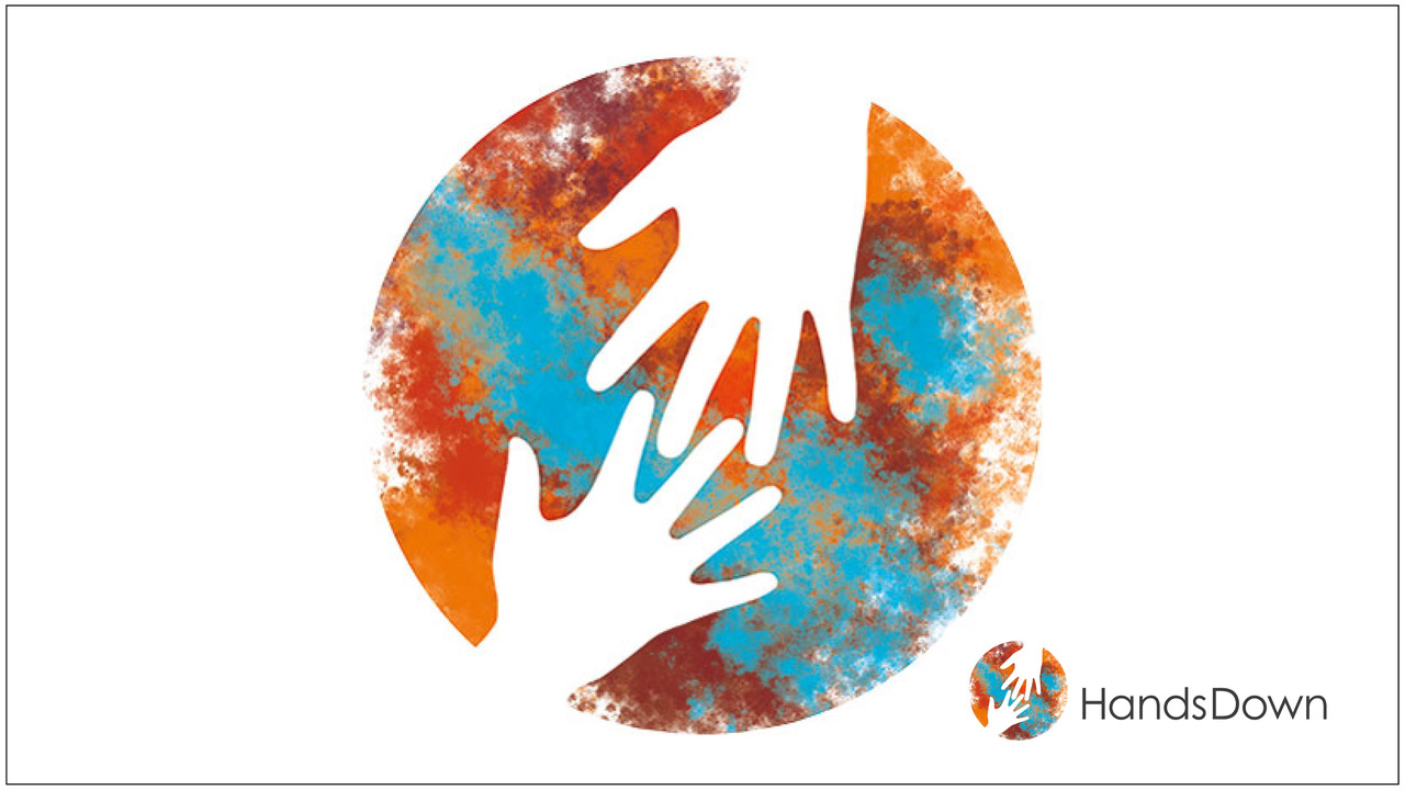
I am a tactile creature and touch has always been my way to explore my environment. Hands help us interpret the world, but they also help us create. I knew hands should be part of the logo. An adult’s helping hand reaching down to a child’s hand represents a giving and a receiving. Interconnected fingers also suggest working together in collaboration, like the cogs of a wheel.
The circle is a favorite symbol of mine, it expresses the feminine, the whole, the planet. The hands over the circle are a kind of blessing for the earth, and goodness knows we need it! Our future and that of the planet really is in our hands.
The logo called for an Australian landscape feel. I moved away from the obvious choice of green. To me nature is a crazy mass of all colours, indeed our planet is predominantly blue when viewed from space. Unintentionally, the colours represent the four elements; earth – orange, water – blue, fire – red, and air – white.
Lastly, the logo loosely references the wonderful Indigenous stencil art created by splattering paint over a hand placed on the wall. I’ve always loved those images.
A final word
What stories are we creating for our future?
 Right now, the dominant stories circling the globe are alarming, not only because they are new but because they threaten to dismantle the familiar structures we rely on.
Whose mask is it?
Logos express and deliver powerfully our intentions, and they, like ball games, unite and divide us.
Team You
Logos express and deliver powerfully our intentions, and they, like ball games, unite and divide us.
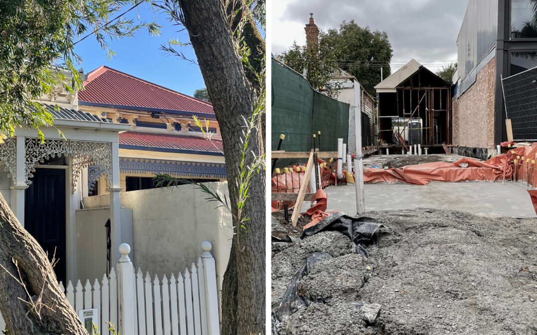
Is your logo just a facade?
Can logos be a ‘facade’, created to invite us to enter but when we open the door does the reality meet our expectations to fully engage?
The power of Pluto. The other one.
I don’t really follow astrology that much, but there has been a buzz around the movement of Pluto (the planet) into Aquarius on 19th November 2024.
Being seen
Good designers ‘see’ their clients and enable them to realise their potential and to ‘see’ their future from a new, clear and achievable standpoint.

Branding a nature play business
A word from one of my clients. I love working with Tamsin and helping her build her wonderful vision. It has been a very satisfying and rewarding journey so far; we have a logo that resonates with the future Tamsin dreams of. Now we are building that for success. Here is Tamsin’s story so far (I asked if I could use her blog, thanks Tamsin).
Why Hands Down? Branding my nature play business
Rebranding a business isn’t easy. Who am I and what do I represent? What message do I want to send out into the world? My brand is me standing up for what I believe in. As an advocate for children connecting with nature, I provide creative nature programs for children and also design natural spaces for play.
The name
I started with more obvious nature-based names for my business and I kid you not, they were pretty much all taken. That in itself says something about this rapidly growing industry I am proud to be a part of. Hands Down came forward as a feeling and I like that it evokes many meanings.
For a start ‘hands down’ is used to describe someone or something that is definitely the best or most important. It evokes winning easily and decisively. Being without a shadow of doubt. That feels good as I believe so strongly that engaging with nature is absolutely essential at this time in history.
In the singular, as in ‘hand down’ the words mean to transmit in succession, as from adult to child. That is exactly what my work stands for. It is up to us to help children get out into nature to compensate for our increasing indoor and technology led lifestyles.
The name suggests hands down in the dirt. To me it implies freedom to be messy and grounded. It is the opposite of ‘hands up’, to ask permission to speak in turn. It advocates for child-led learning through spontaneous play.
The image
I am a tactile creature and touch has always been my way to explore my environment. Hands help us interpret the world, but they also help us create. I knew hands should be part of the logo. An adult’s helping hand reaching down to a child’s hand represents a giving and a receiving. Interconnected fingers also suggest working together in collaboration, like the cogs of a wheel.
The circle is a favorite symbol of mine, it expresses the feminine, the whole, the planet. The hands over the circle are a kind of blessing for the earth, and goodness knows we need it! Our future and that of the planet really is in our hands.
The logo called for an Australian landscape feel. I moved away from the obvious choice of green. To me nature is a crazy mass of all colours, indeed our planet is predominantly blue when viewed from space. Unintentionally, the colours represent the four elements; earth – orange, water – blue, fire – red, and air – white.
Lastly, the logo loosely references the wonderful Indigenous stencil art created by splattering paint over a hand placed on the wall. I’ve always loved those images.
A final word
What stories are we creating for our future?
Right now, the dominant stories circling the globe are alarming, not only because they are new but because they threaten to dismantle the familiar structures we rely on.
Whose mask is it?
Logos express and deliver powerfully our intentions, and they, like ball games, unite and divide us.
Team You
Logos express and deliver powerfully our intentions, and they, like ball games, unite and divide us.
Is your logo just a facade?
Can logos be a ‘facade’, created to invite us to enter but when we open the door does the reality meet our expectations to fully engage?
The power of Pluto. The other one.
I don’t really follow astrology that much, but there has been a buzz around the movement of Pluto (the planet) into Aquarius on 19th November 2024.
Being seen
Good designers ‘see’ their clients and enable them to realise their potential and to ‘see’ their future from a new, clear and achievable standpoint.