Phoenixes, rainbows pink and bridges
Before I begin any creative work for a client, there are myriad questions to ask. These include the usual such as details of their vision, timescale, ideal or typical clients…. and their preferences.
While it is important that clients must love their logo, it is equally important that the design extends beyond the limitation of their personal preferences. Without this extension we are simply navel gazing and the client’s vision has a limited chance of engaging those others required to build growth and success.
Because many of my clients are entrepreneurs, wanting to create a new business, they are inevitably very excited at the prospect of a new future; they may be re-emerging out of the ashes of their failures, or holding a vision to transform other’s lives through their service or product, or simply to, in some way, create a better life or world.
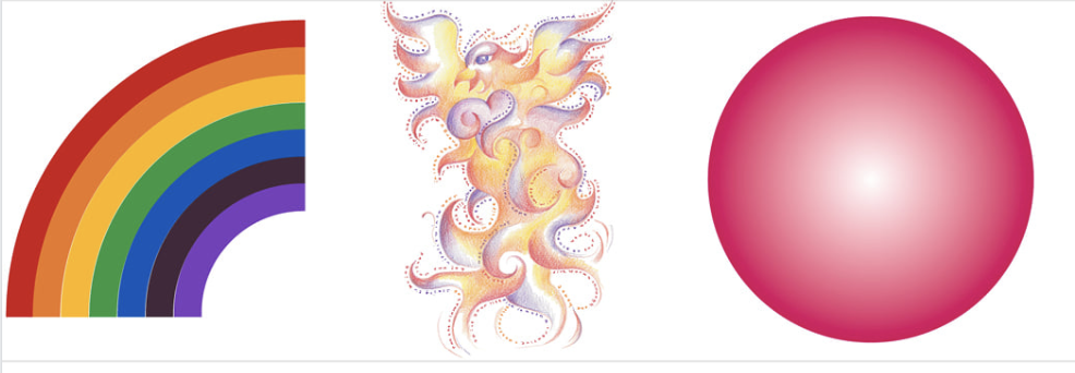
So transformational imagery can abound. Butterflies, dragonflies, roses, phoenixes, rainbows and bridges often arise in the client’s suggestions. I understand it, each of these are powerful images in shamanism and identity change, rebirth, revelation and similar.
But if I, or any other professional designer, simply satisfies their client’s personal egos it is like creating half a bridge. They might love the look but if it does not reach out to touch the hearts and minds of others then their dream remains in its birthplace, the world of dreams. We need others to help create a vision on the ground. A successful logo is a visual and verbal connection between the client’s dreams and those in the outside world who can help them come true.
Of course the client’s input is invaluable in getting to the right design, so when they say their business is like a phoenix arising from the ashes, or a rainbow of positivity or as magical as a unicorn we need to listen and dig deeper. For example if they say ‘I love pink’ and it initially appears to have little to identify their product, what are they really indication? What does pink mean to them deep down? Is it dark or light, and why? Could it be tempered or enhanced with a secondary colour and, if so, what? A dark blue will contrast a pale pink; a lime green can be the same hue as a magenta pink. Each variation delivers a different feeling to the viewer. It might be that the feelings of pink are expressed in other means. Different shapes and objects are softer, a rounded shape, a heart, or a gentle furry animal might echo the values of pink that the client loves.
Each of these decisions will make a difference to the final outcome.
We, as designers, have a sacred purpose to take our clients on a powerful journey to identify their vision. It requires acute observation, listening for the jewels from the unconscious, and negotiating through it to creation.