
Is anything original?
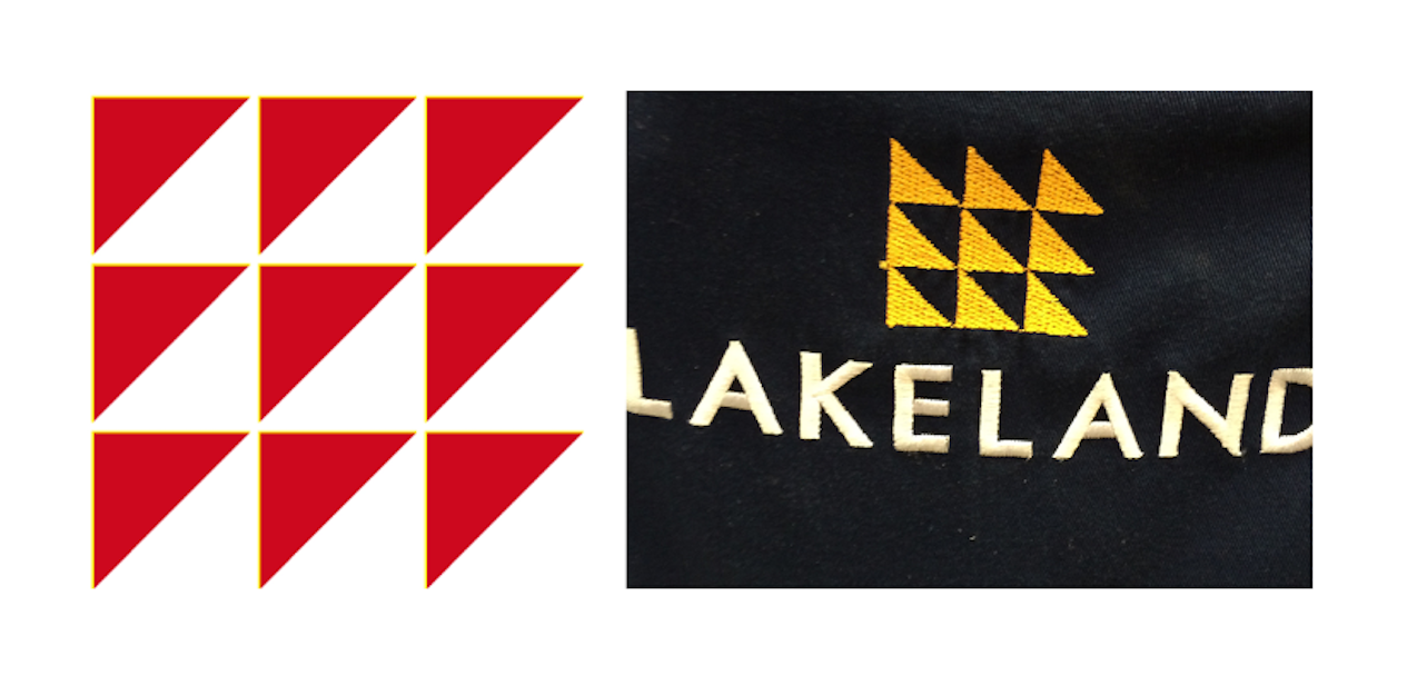
Shopping in Taunton in the SW of England, I noticed the new Lakeland logo. It was virtually the same as a logo, for a very different purpose, I designed many years ago in London.
It was one of the first logos I designed and, as a new freelancer, this client was a huge undertaking for me. William Press was an engineering group with scores of differently named companies, each with their own logos and typefaces, that had no cohesion in identity. This diminished its value on the Stock Exchange and I was commissioned to help change that.
Working with the Group Board and management, I developed an identity system based on a common abstract logo and associated typeface that could be utilised by all companies within the group. That is, each company had its own name identity but represented by the same typeface alongside the group logo. Once agreed, the new system had to be implemented across all items used by the 20,000 employees. These included its utilisation on more than 3, 000 vehicles and roadside plant, promotional literature, from the annual report and accounts to the various operating company brochures and manuals, stationery, ties and flags.
The key to the success of this process was the design and distribution of a visual standards manual which laid all the rules of usage of the various elements of the identity.
I was pleased to learn that when years later William Press merged with Fairclough Engineering to become Amec, the symbol was retained; it had firmly established and identified itself with a successful engineering business.
So it was a nostalgic moment to see Lakeland’s new logo echoing my original William Press design from so many years ago. I wondered how two such different businesses, one based in engineering and the other in domestic kitchen and home supplies, could end up with the same logo. Then I understood, inspiration can come from many sources and we both got the inspiration from the initials.
When I played with the W and P of William Press I managed to reduce it to triangles, three to be exact. I liked the use of triangles, they are a very stable structure, familiar in the world of engineering. By repeating the three triangles three times, we created a square, also a very structural shape, and made the logo just that much more interesting. With Lakeland, the triangles were on their side, of course the initial they were reflecting is the L in Lakeland. Perhaps they reproduced it repeated to visually represent the range of products they sell. Who knows? But it is, in my opinion, a lovely logo.